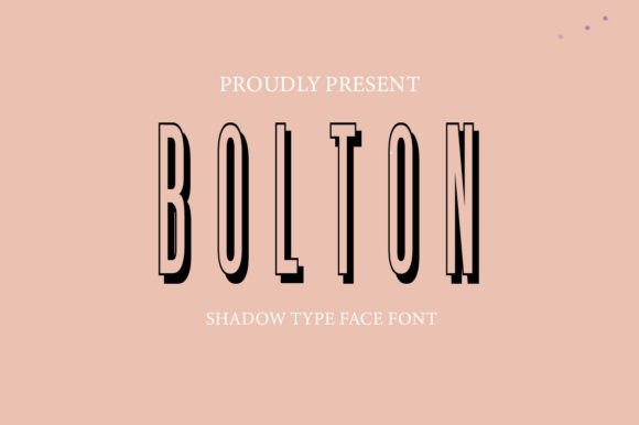
Bolton Font: Adding Modern Depth to Web Headers
I was staring at a hero section for a new creative coaching website last Tuesday, and something felt off. The layout was clean, the photography was aspirational, and the color palette was perfectly muted. Yet, the headline lacked the specific gravity the brand needed. It looked flat. In digital product design, we often talk about whitespace and grid systems, but typography is usually where the emotional connection actually happens. I decided to swap out the safe geometric sans serif I had been using and test Bolton, a shadow-display font that promised to cast designs into a stylish dimension. The difference in the mockup was immediate.
Bolton isn't just another decorative typeface; it is a lesson in visual hierarchy. As web designers and UI creators, we are constantly balancing aesthetic impact with functional readability. When you introduce a display font with built-in dimensional effects like Bolton, you are making a bold choice. You are telling the user that this specific line of text matters more than anything else on the screen. In my recent project testing, I found that Bolton works best when treated as a primary focal point rather than a supporting actor. It brings a sleek, contemporary aesthetic that feels right at home in modern editorial layouts, boutique e-commerce headers, and high-impact landing pages.
Testing Dimensional Type in Hero Sections
The first place I implemented Bolton was the main H1 tag above the fold. For a coaching brand, trust and authority are paramount, but so is approachability. Traditional bold sans serifs can sometimes feel too corporate or sterile, while script fonts can lack legibility on smaller screens. Bolton sits in a unique middle ground. Its bold letterforms command attention, but the subtle shadow effect adds a layer of warmth and tactile reality that flat type simply cannot achieve.
When placing this font over a complex background image, I had to be mindful of contrast. Shadow-display fonts rely on negative space and lighting cues to create their depth. If the background is too busy, the shadow gets lost, and the text becomes muddy. I found that Bolton performs exceptionally well against solid colors, gradients, or images with significant negative space. On the coaching site, we used a soft, desaturated portrait with ample headroom. The Bolton headline floated effortlessly, creating a sense of premium quality without needing additional graphic elements like drop shadows added via CSS, which can sometimes render inconsistently across browsers.
Readability and Mobile Responsiveness
Any time you use a stylized display font in web design, mobile responsiveness is the ultimate stress test. What looks dynamic on a 27-inch monitor can become illegible clutter on an iPhone SE. During my responsive testing phase, I paid close attention to how Bolton scaled down. Because the shadow detail is intrinsic to the glyph design, it holds up better than extrinsic CSS effects, but size still matters.
- Minimum Sizing: I recommend keeping Bolton above 24px on mobile devices. Below this threshold, the internal details of the shadow effect can merge, reducing clarity.
- Line Height Adjustments: Display fonts with vertical depth often require increased line-height settings. Standard 1.2 or 1.4 ratios might cause the shadows of descending letters to clip into the ascenders of the line below. Bumping this to 1.6 ensured breathing room.
- Short Phrases Only: This is not a paragraph font. Use it for punchy headlines, short value propositions, or button labels (if sized appropriately). Never use Bolton for body copy or long-form content.
For the coaching website, we restricted Bolton strictly to the main hero headline and three key benefit pillars. Everything else utilized a clean, neutral sans serif. This restraint preserved the font’s impact. If everything screams for attention, nothing gets heard. By limiting its usage, Bolton remained a special event on the page, guiding the user’s scanning behavior exactly where we wanted it to go.
Strategic Font Pairing for Digital Brands
A premium font like Bolton needs a reliable partner. In UI design, pairing is about creating harmony through contrast. Since Bolton has such a distinct personality and structural weight, its partner should be invisible and utilitarian. I paired it with a highly legible neo-grotesque sans serif for the body copy, navigation, and footer. This combination created a sophisticated editorial feel reminiscent of high-end fashion magazines or luxury lifestyle blogs.
If you are designing for a more traditional or academic audience, consider pairing Bolton with a classic serif font for subheaders. The juxtaposition of the modern, dimensional display face against the timeless structure of a serif creates a fascinating tension that signals both innovation and heritage. However, avoid pairing Bolton with other decorative fonts, scripts, or handwritten styles. The visual noise would be overwhelming and detrimental to the user experience. Let Bolton be the soloist while the rest of your typography acts as the orchestra.
Practical Applications Across Web Projects
Beyond the coaching site, I have explored Bolton in various other digital contexts during recent client work. Its versatility within the display category is surprising, provided you respect its bold nature. Here is where I see it adding the most value:
- Boutique E-Commerce: Use Bolton for collection titles or sale announcements. The dimensional aspect mimics physical signage, bridging the gap between digital shopping and brick-and-mortar experiences.
- Creative Portfolios: Perfect for naming projects or highlighting core skills. It adds a layer of craftsmanship to a designer’s own brand identity.
- Course Sales Pages: Module titles and transformation statements benefit from the authoritative yet engaging tone Bolton provides. It makes learning outcomes feel tangible.
- Digital Brand Kits: Include Bolton as the primary display option for social media templates and ad creatives. Consistency across these touchpoints reinforces brand recognition.
In each of these scenarios, the common thread is intentionality. Bolton elevates the perceived value of the content. It suggests that the brand invested in custom assets rather than relying on system defaults. For entrepreneurs and small business owners, this perception of polish can directly influence trust and engagement.
Technical Considerations Before Implementation
Before dropping Bolton into your next Figma file or WordPress theme, there are practical logistics to verify. Always check the licensing terms carefully. Commercial font licenses vary significantly; what is free for personal use may require a paid tier for client websites, especially those involving e-commerce or paid courses. Ensure your license covers webfont embedding (@font-face) and the expected monthly page views.
Also, inspect the included character set. Does Bolton support the languages your target audience speaks? Missing accents or special characters can force fallback fonts that break the visual immersion. Check for OpenType features as well. Some versions of display fonts include alternate glyphs or ligatures that can add even more uniqueness to your logo design or header treatments. Finally, optimize your webfont files. Subset the font to include only the characters you need to keep load times fast. A beautiful shadow-display font is useless if it causes a cumulative layout shift because the file took three seconds to download.
Ultimately, Bolton is a tool for storytelling. It transforms plain text into a graphical element that carries mood, era, and attitude. When used with UX-awareness and typographic discipline, it helps build online brand experiences that feel curated, professional, and distinctly human. Just remember: let it shine in the spotlight, and give it the space it deserves.